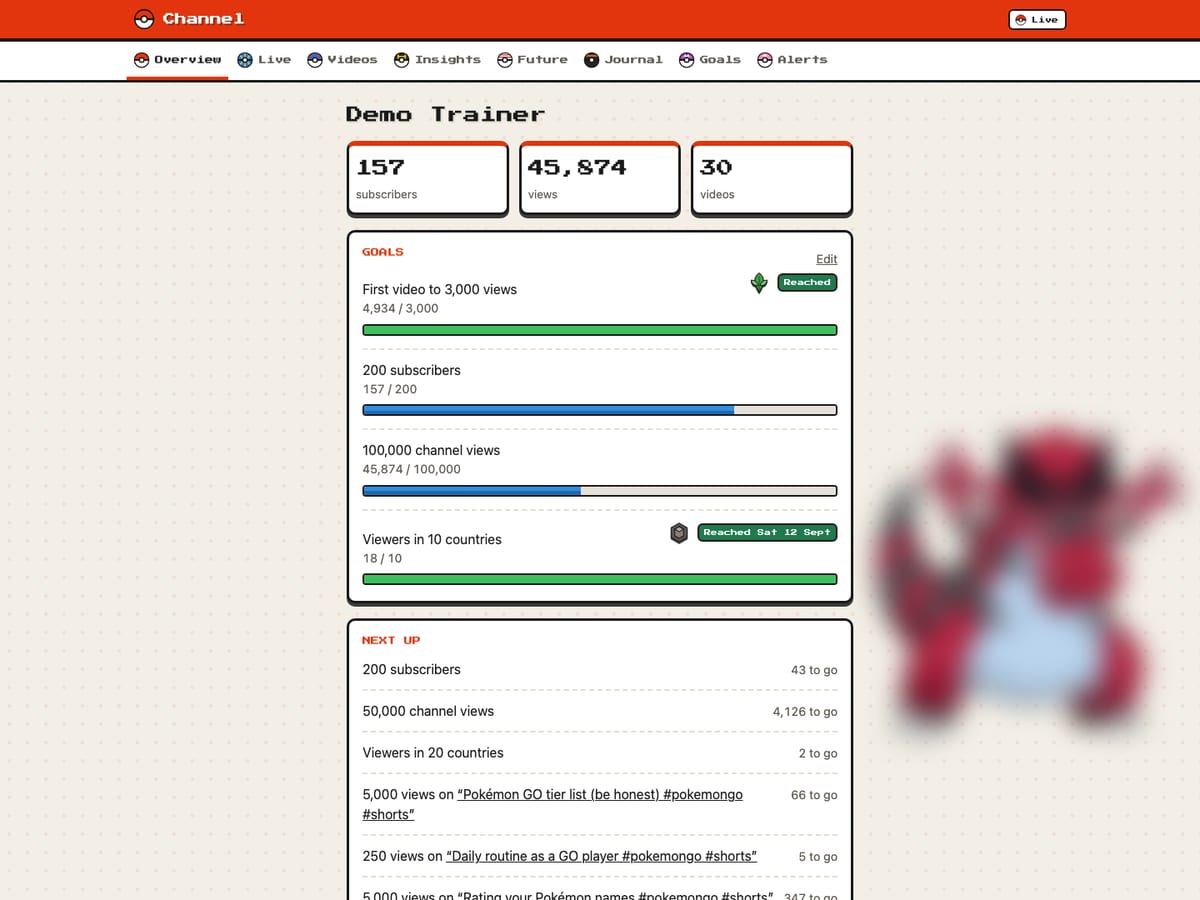
My kid makes YouTube Shorts about Pokémon. I wanted a dashboard that helps with decisions about future videos. When to post, what works best in titles and thumbnails, and whether an idea paid off. Not a wall of raw numbers.
It is private, it compares the channel only with its own history, and it is dressed as a Pokémon game.
A note on the screenshots
Every screenshot on this page comes from a demo copy running locally, with made-up videos and numbers. None of it is the real channel. The Pokémon artwork beside each page is blurred, and the thumbnails are empty placeholders.
What it does
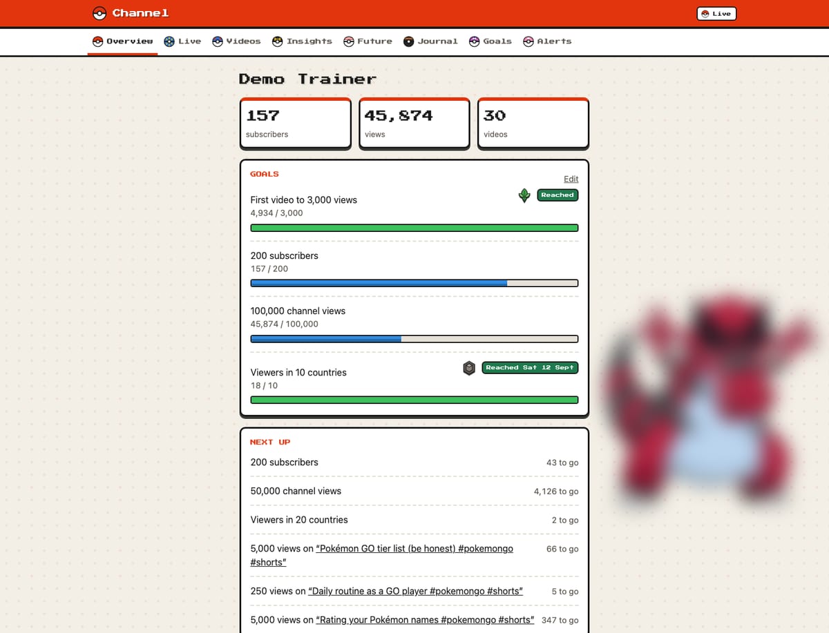
- 1Navigation. One page per question. Each page has its own Poké Ball, drawn as inline SVG, and the pixel font for headings.
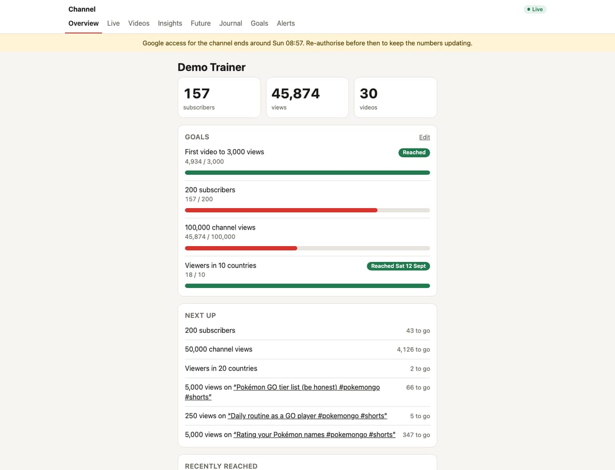
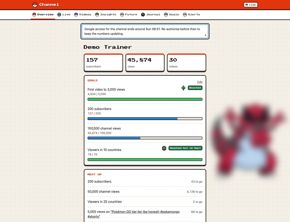
- 2The numbers. Subscribers, views and videos, styled like a Pokémon menu.
- 3Gym badge. Each goal reached earns a Sinnoh gym badge, in order. From the ninth goal on, it earns a Champion Ribbon.
- 4Partner Pokémon. Every page has its own, fixed behind the content. Blurred here.
- 5Next up. The goals and view milestones closest to being reached.
Here are the pages, in the order they appeared.
- Overview. Counts, goals and what is closest to being reached.
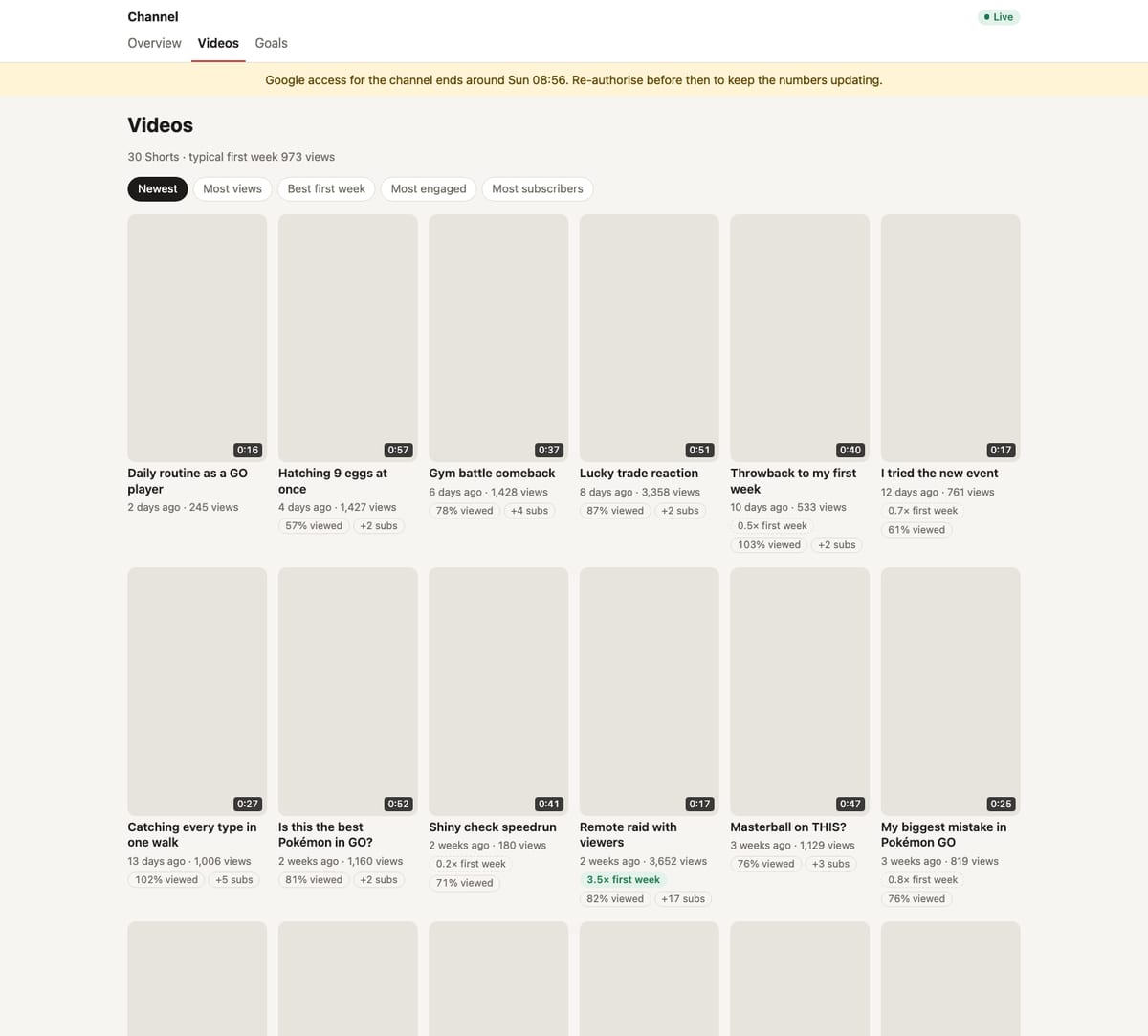
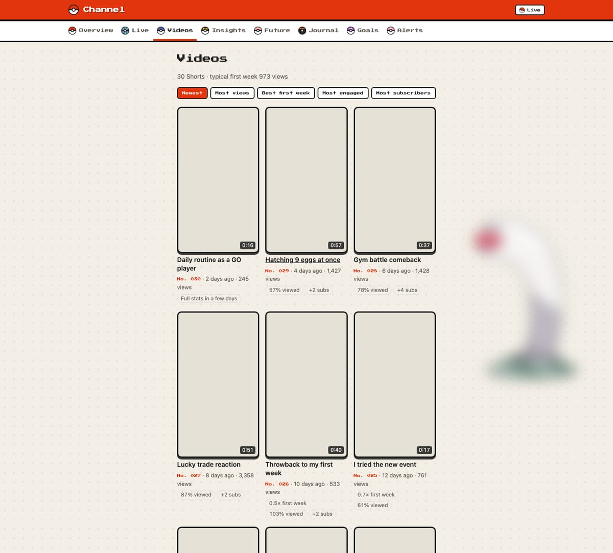
- Videos. Every Short with its key numbers, sortable, with a badge for how it did against a typical video. Each video gets a Pokédex number in publishing order, and a Shiny tag when its first week is at least twice the typical one.
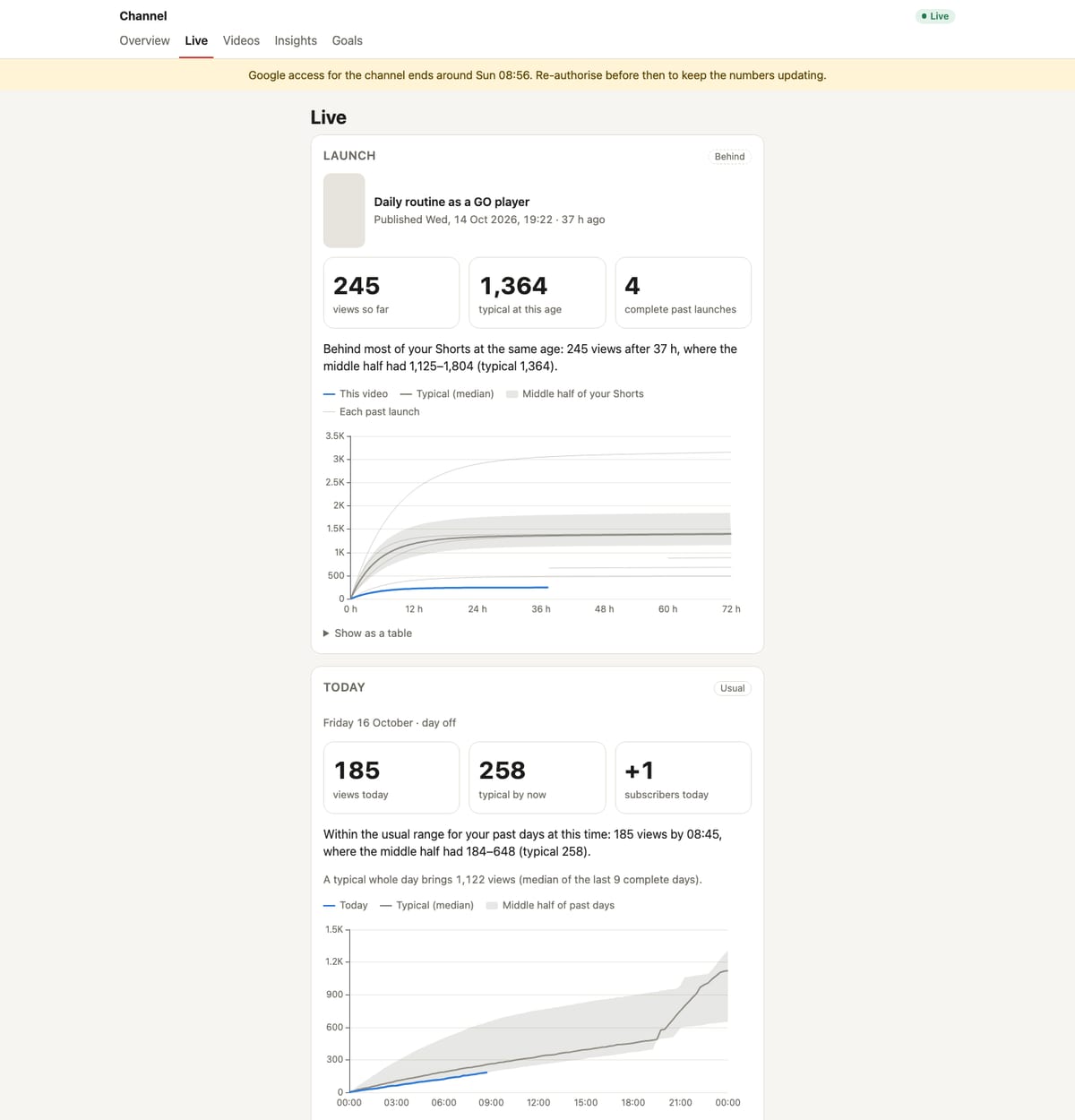
- Live. The newest video's launch against past launches, and today's views against a typical day.
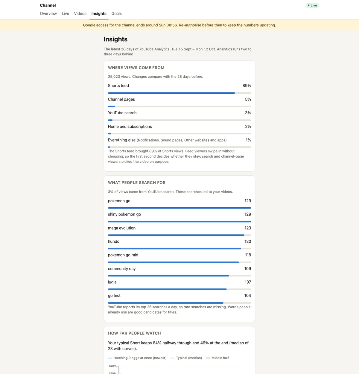
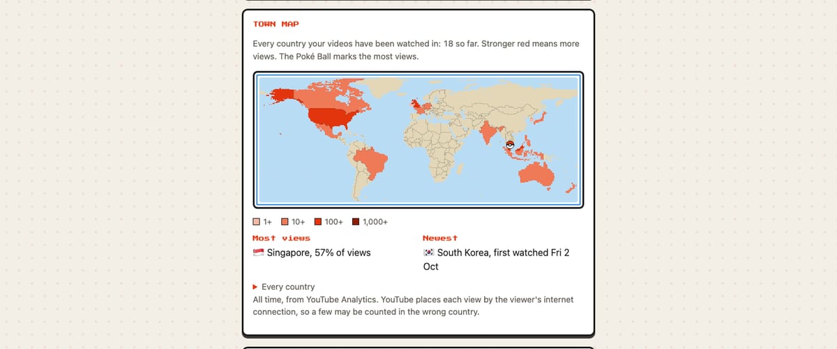
- Insights. Where views come from, what people searched for, how long they watched, thumbnail click-through, and a Town Map of every country that has watched.
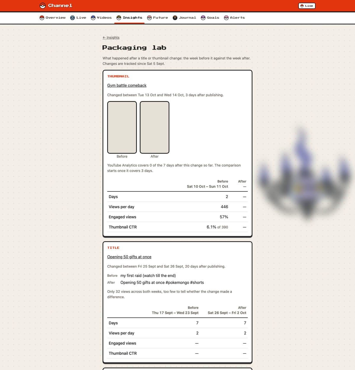
- Packaging lab. Every title or thumbnail change, the week before against the week after, compared with how other videos did at the same age.
- When to post. When viewers watch, and how launches did by posting time.
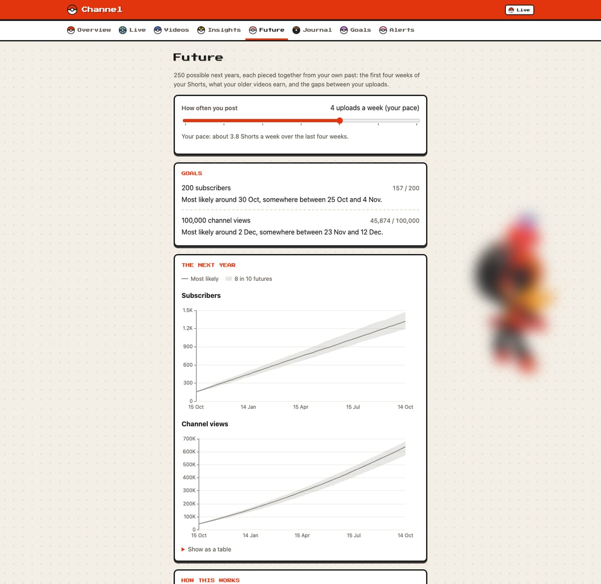
- Future. Likely dates for each goal and a range for the next year, with a slider for how often to post.
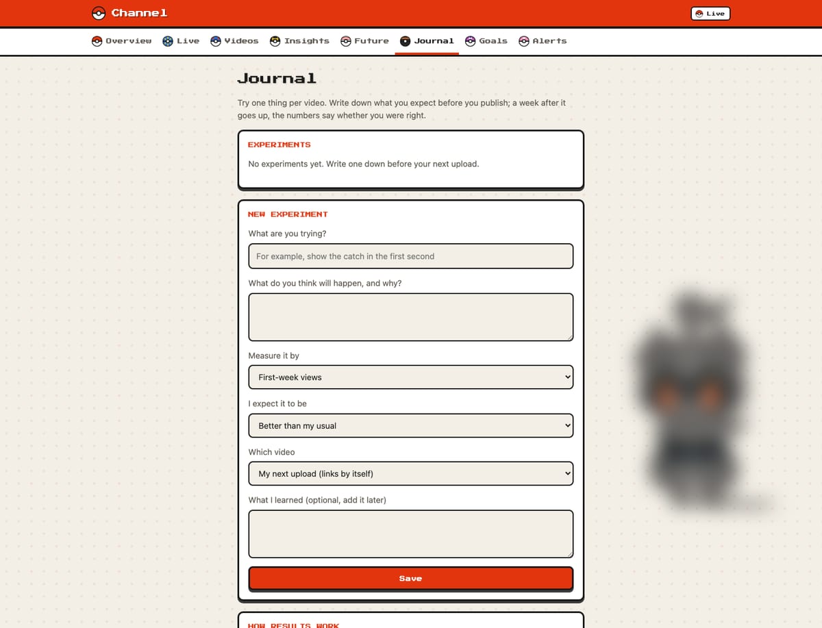
- Journal. An idea and a prediction written before publishing, judged a week later against earlier videos.
- Goals and alerts. Add, edit and reorder goals, and turn on phone notifications.
How it fits together
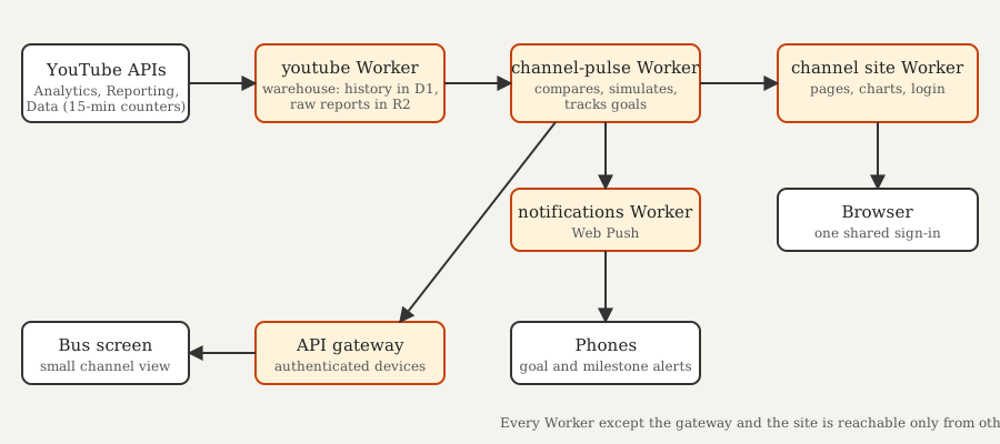
It runs on Cloudflare Workers, split the same way as the bus screen.
- A warehouse Worker. It collects everything YouTube will tell it. It reads the channel's counters every fifteen minutes, pulls daily Analytics and Reporting data, and keeps the history in a D1 database, with the raw reports in R2. It is the only part that talks to YouTube.
- A channel-pulse Worker. This is the brain. It compares videos with the channel's own past, tracks goals, runs the Future simulation and decides when something deserves a notification.
- The site. It renders pages on the server and adds one small script that draws charts with ECharts. It has no logic of its own and one shared login.
- A notifications Worker. It sends Web Push messages to phones.
The same channel-pulse data also drives a small version of the dashboard on the bus screen in the afternoon and evening.
How it grew
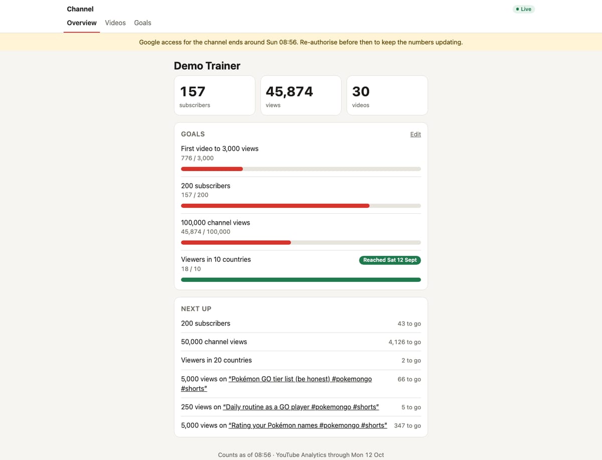
I built it over a few days, and it changed shape as I saw what was useful. Every screenshot below shows the code as it was at that point.
Pages worth a closer look
Problems worth remembering
Statistics need to be honest. With a handful of videos it is easy to read meaning into noise. Comparisons only appear once there are enough past launches, change comparisons say when there are too few views, and the Journal keeps its verdict even if YouTube later revises the numbers. The Future page also says what it cannot see. A video that does far better than anything before it is not in the past, so it is not in the forecast.
Google access expired every week. While the Google app was still in testing, the authorisation had to be renewed every seven days. The dashboard warned before it lapsed. Once the app was published, the weekly expiry went away.
A lapse in access must never delete anything. The warehouse never deletes data when access is lost. It keeps a title history, and there is a weekly backup.
Web Push is encrypted, and easy to get subtly wrong. I tested my implementation against the worked example in the specification, so a notification that fails to arrive is not a mystery.
A sign-in that failed on some browsers. Some browsers send a null Origin with the sign-in form. That needed its own fix, because the site otherwise accepts only same-origin form posts.
What's next
Right now the channel makes only Shorts. If longer videos arrive, they will need comparing with each other, not with Shorts. The comparisons are already made within a format.