Every school morning the same question comes up. Has the bus gone yet, and do we need to run? I wanted the answer on a wall, readable from across the hallway, without picking up a phone. So I built a small e-paper screen that tells us.
What it does
In the morning it shows the two bus services we use. The second one depends on the day, more on that below. Each service gets its next and following arrival, a tag that says whether the time is live or only scheduled, the bus type, the weather and a lightning warning. When a bus reports its position, the screen also draws a row of stops ending at ours, so you can watch it creep closer.
The screen changes jobs through the day. In the afternoon it shows a small version of my kid's YouTube channel dashboard. In between it shows quiet generated artwork. Overnight it does nothing and makes no network requests.
How it fits together
The screen is deliberately dumb. It holds no API key and never talks to the bus or weather providers. It asks one authenticated endpoint what to show, then draws the answer.
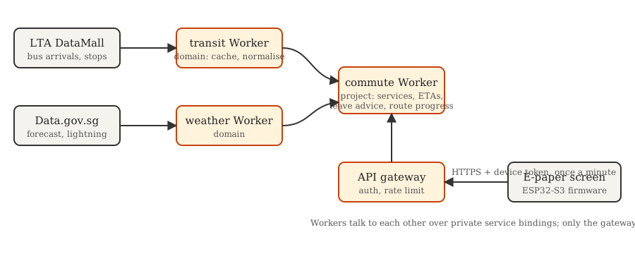
The backend has three kinds of Worker, and splitting it this way was the best decision in the project.
- Domain Workers. Each one owns a single subject and its providers. The transit Worker holds the bus API key, caches arrivals for a minute and cleans up the data. The weather Worker does the same for forecast and lightning.
- The project Worker. The commute Worker picks the right services for the day, works out leave advice and estimates where each live bus is on its approach.
- The gateway. It is the only public door. It checks the device's token, allows one request a minute and passes the call on.
The response describes meaning, not pixels. It says a bus is three stops away, not "draw a circle at x=412". The same data can drive an LED matrix or a web page later without touching the backend.
Hardware
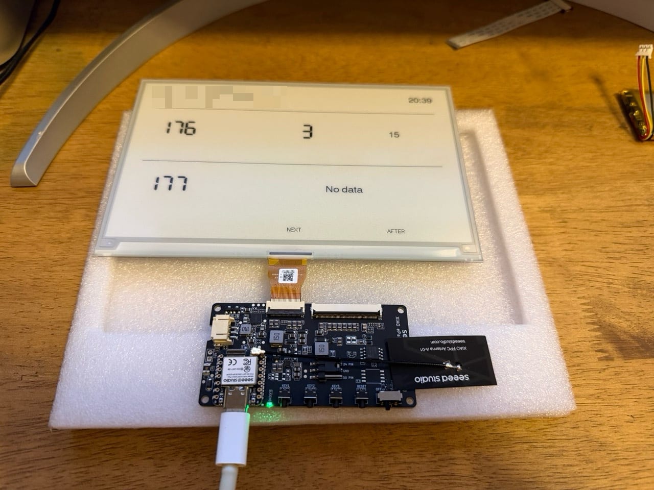
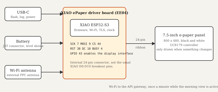
- TRMNL 7.5-inch e-paper DIY kit. It has a Seeed XIAO ePaper driver board with an ESP32-S3 module, an external Wi-Fi antenna and an 800×480 panel.
- A USB-C data cable for flashing.
- A battery on the board's JST connector. The screen shows its charge.
- A 3D-printed grey stand and case.
- Firmware built with PlatformIO and the
bb_epaperlibrary.
The case
I printed the enclosure from a remixed triangular-prism design on MakerWorld. It was the fiddliest step of the whole project. The board only just fits, and the panel's ribbon cable has to be twisted and folded exactly right to get everything in with the screen sitting flat. That is not the designer's fault. A stiff cable and a tight case were always going to be awkward. Budget plenty of patience.
Two services, depending on the day
The screen always shows the 176. The second service is the 177 on weekdays and the 963 at weekends. It follows the day of the week, not whether school is in, so a weekday holiday still shows the 177. The commute Worker knows the route and stop sequence for all three services, which is what lets it draw the route line.
Weather and lightning
The screen pulls three Data.gov.sg feeds: a two-hour forecast, air temperature and lightning strikes. A few tricks make them useful on a screen this small.
- Nearest, not national. The forecast comes per area and the temperature per weather station. The Worker finds the area and station closest to the house by great-circle distance and shows only those.
- A lightning alarm with a rule. Strikes from the last 15 minutes count, and the alert shows if any is within 6 km. Strikes stamped slightly in the future are ignored, so a small clock difference does not cause a false alarm.
- Each feed fails alone. The three requests run in parallel and settle independently. If lightning data is down, the bus times, forecast and temperature still show, and the screen says "Lightning data unavailable" instead of going blank. One of the photos below caught it.
- Cached to match each feed. Forecast for 30 minutes, temperature for 5, lightning for 2 and bus arrivals for 1.
- Leave advice. The Worker takes the first of the next two buses on each service that I can still catch, allowing six minutes to reach the stop, and works out how long I have left.
Single or double decker, and how full it is
The bus arrival API returns more than a time. Each bus reports whether it is a single-decker, a double-decker or a bendy bus, whether it is wheelchair accessible, and whether its time comes from a live GPS position or only the timetable. It also reports how full it is, as seats available, standing available or limited standing.
Type and crowding both matter to us, so the screen shows them. A bus icon is single or double deck, three small figures fill as the bus gets busier, and a clock icon marks times that are only scheduled. I love that all of this comes from a public API.
Problems worth remembering
The pins are not the ones in the usual diagram. This board connects the display through an internal 24-pin connector, not the standard breakout pins, so the common wiring examples are wrong for it. The real GPIO map lives in one header file, and that file is the single source of truth.
E-paper has opinions about refreshing. The partial refresh mode looked patchy and uneven. A full-screen flash every few seconds looks bad and is hard on the panel. The fix was to use the controller's faster differential waveform for routine updates, keep the full cleaning flash for startup, and redraw only when something visible changes. The clock is the exception. A new minute is a visible change, so the screen redraws exactly on the minute boundary.
Certificates change. Cloudflare can serve the API's certificate from several authorities, so one early fix was about which certificate the firmware trusts. It now trusts the roots of every authority Cloudflare might use. A test checks each fingerprint and fails if any root is within 30 days of expiry.
Showing a bus's progress took real geometry. The transit API gives a bus's latitude and longitude, not stops away. The commute Worker projects that point onto the closest segment of the known route and counts the stops left. Within 80 metres of home counts as arrived. A bus with no live position gets an empty route instead of a guess.
Firmware and backend must agree. Both sides test against the same example payloads. If a backend change would break the device, the tests fail long before it reaches the wall.
Flashing by cable gets old. Six weeks in I added password-protected over-the-air updates, so a fix no longer needs a USB cable. The screen also prints the commit it was built from in a corner, which makes an update easy to confirm.
How it grew
The screen changed a lot between the first draw and the version on the wall. Each photo below is the real screen at a different stage, in the order they happened.
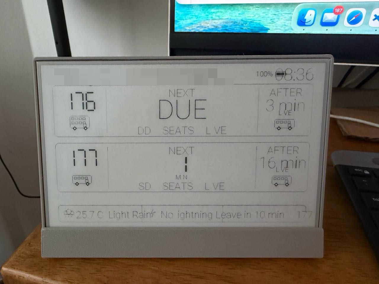
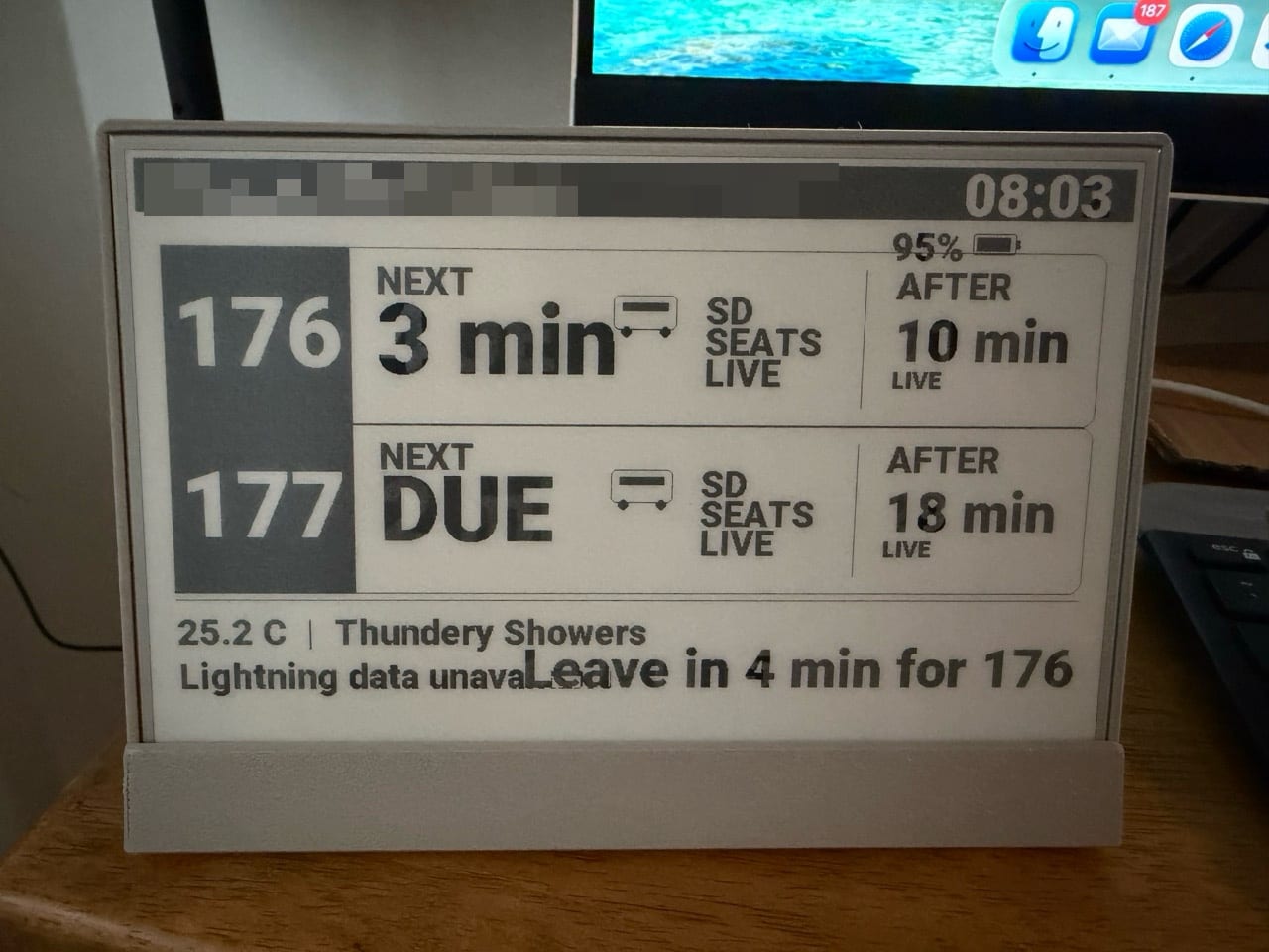
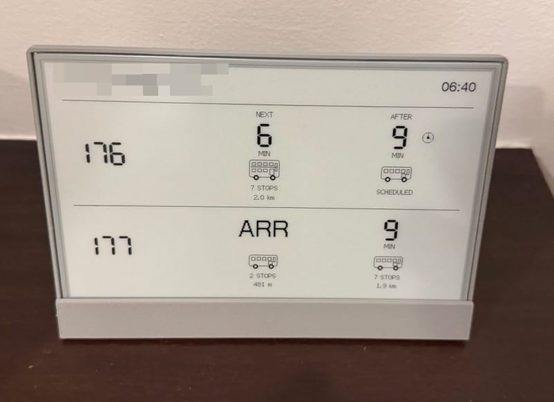
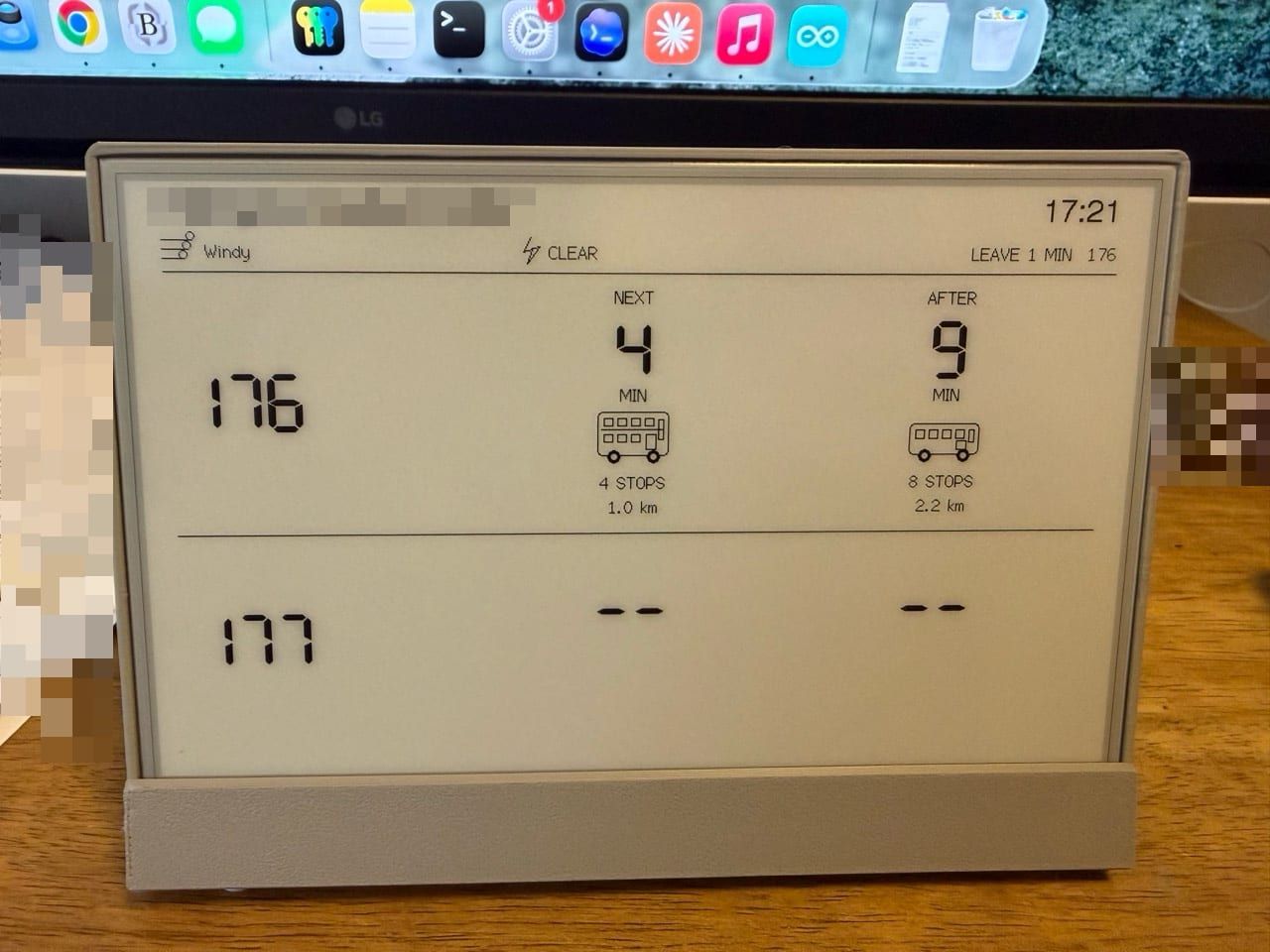
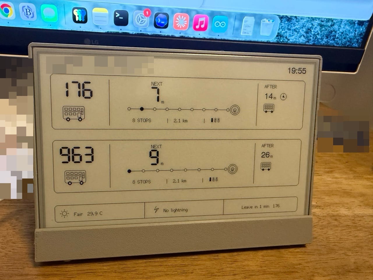
The last step is the version on the wall, shown next. It has heavier type, a clearer card for each service, and a footer that goes back to weather, lightning and battery.
The finished screen
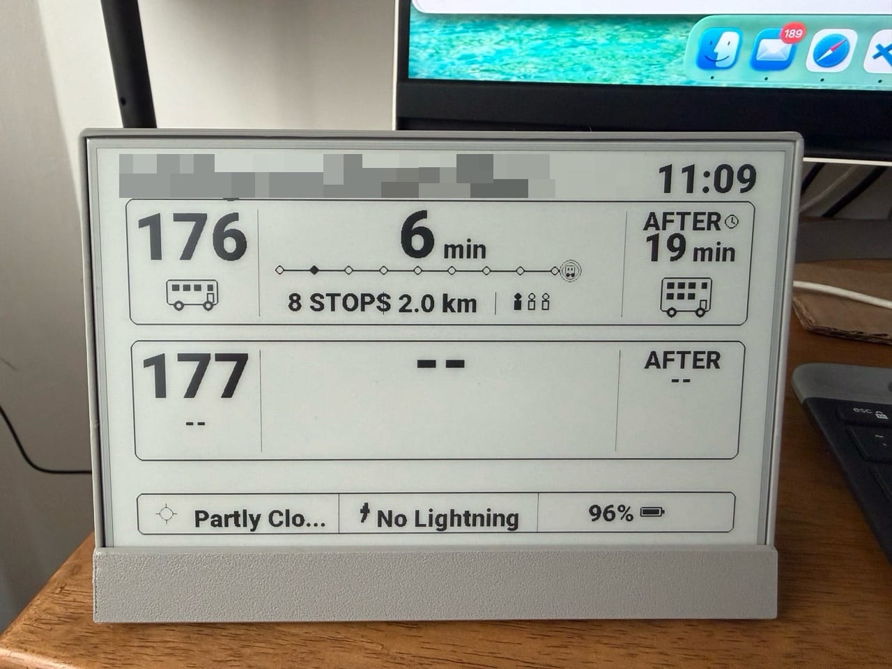
- 1Service. The 176 is always there. The second card is the 177 on weekdays and the 963 at weekends.
- 2Next bus. Minutes until the next bus.
- 3Route line. Each dot is a stop. The filled dot is where the bus is now and the line ends at the home stop.
- 4Stops and distance. How many stops away, and the straight-line distance.
- 5How busy. Three figures that fill as the bus gets fuller.
- 6Bus type. Single-decker here. The 'after' bus is a double-decker.
- 7Scheduled. The clock icon means the time comes from the timetable, not a live position.
- 8No bus. Dashes when nothing is running or there is no data.
- 9Clock. Singapore time. A new minute is what triggers a redraw.
- 10Weather. Forecast for the nearest area, cut short to fit.
- 11Lightning. Alert if a strike landed within 6 km in the last 15 minutes.
- 12Battery. Charge level.
The rest of the project moved along with the screen.
- 30 to 31 August 2026. The first backend, firmware and display layout, then live route progress and minute-aligned refreshes.
- October 2026. The household school calendar decides when the morning window opens, the YouTube channel view joins the screen, the firmware gets a table of views in priority order, and updates arrive over Wi-Fi.
What's next
The same backend and firmware pieces are built for reuse. A second screen, an LED matrix or another household dashboard can read the same projects without any new provider integration.